Process
Initial Brainstorm
This is my final project for DES 111 at UC Davis, a creative coding class for
designers using
processing
[a graphical library and IDE using the Java language]. The assignment was open ended
and I was granted complete creative and conceptual control.
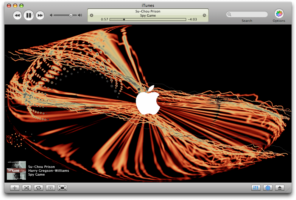
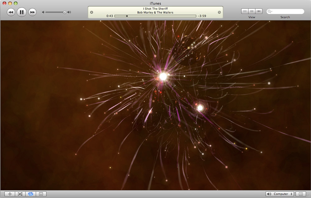
My initial brainstorm for this project was inspired by early 2000s iTunes music
visualizers. I remember loving to watch the animations on my family computer while I
listened to music as a child -- but I always felt frustrated that the visualizers
were not connected to the beat of the music.
For my project, I resolved to make a customizable music visualizer of my own that
would follow the bpm of the song at hand.
Initial UX/UI Design
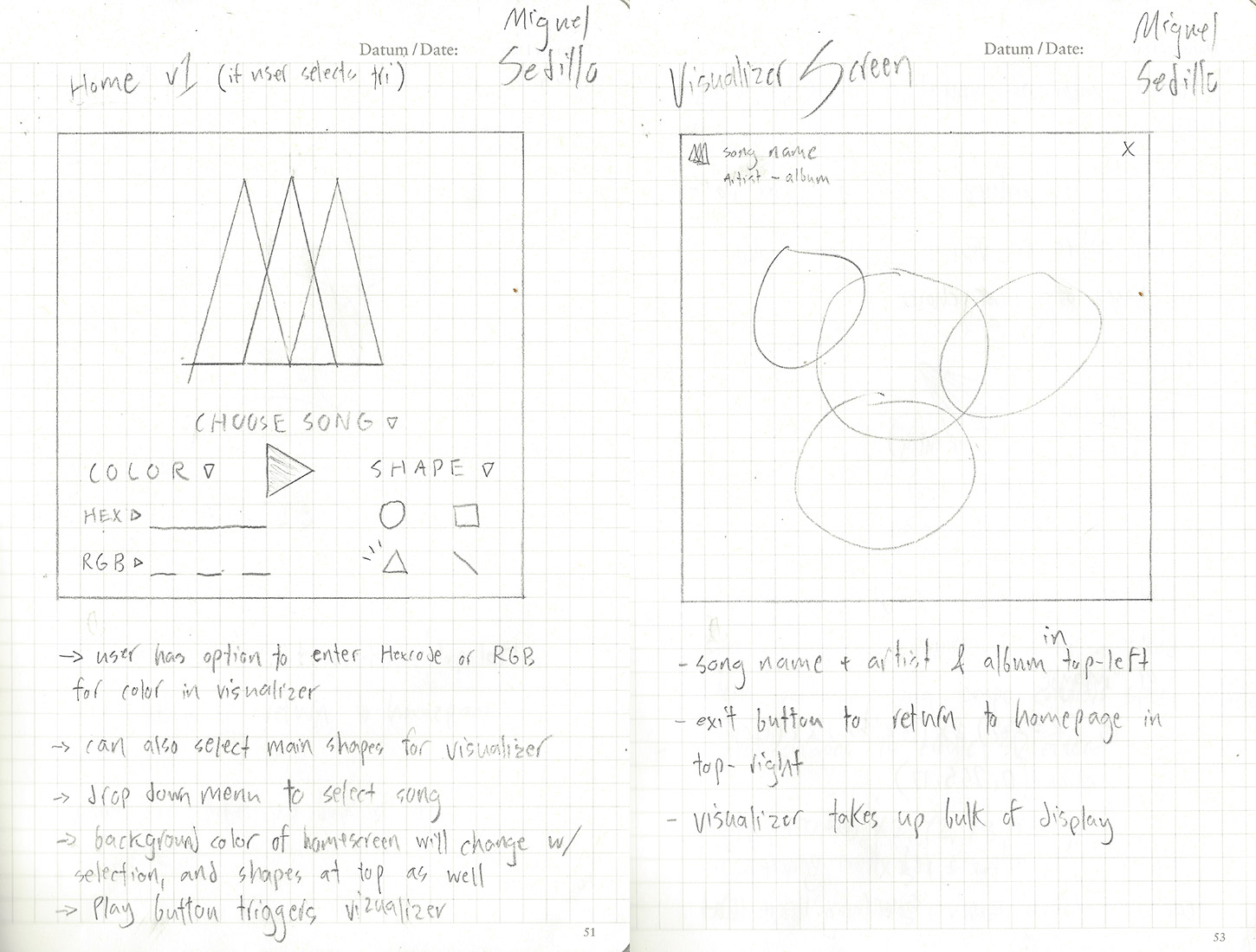
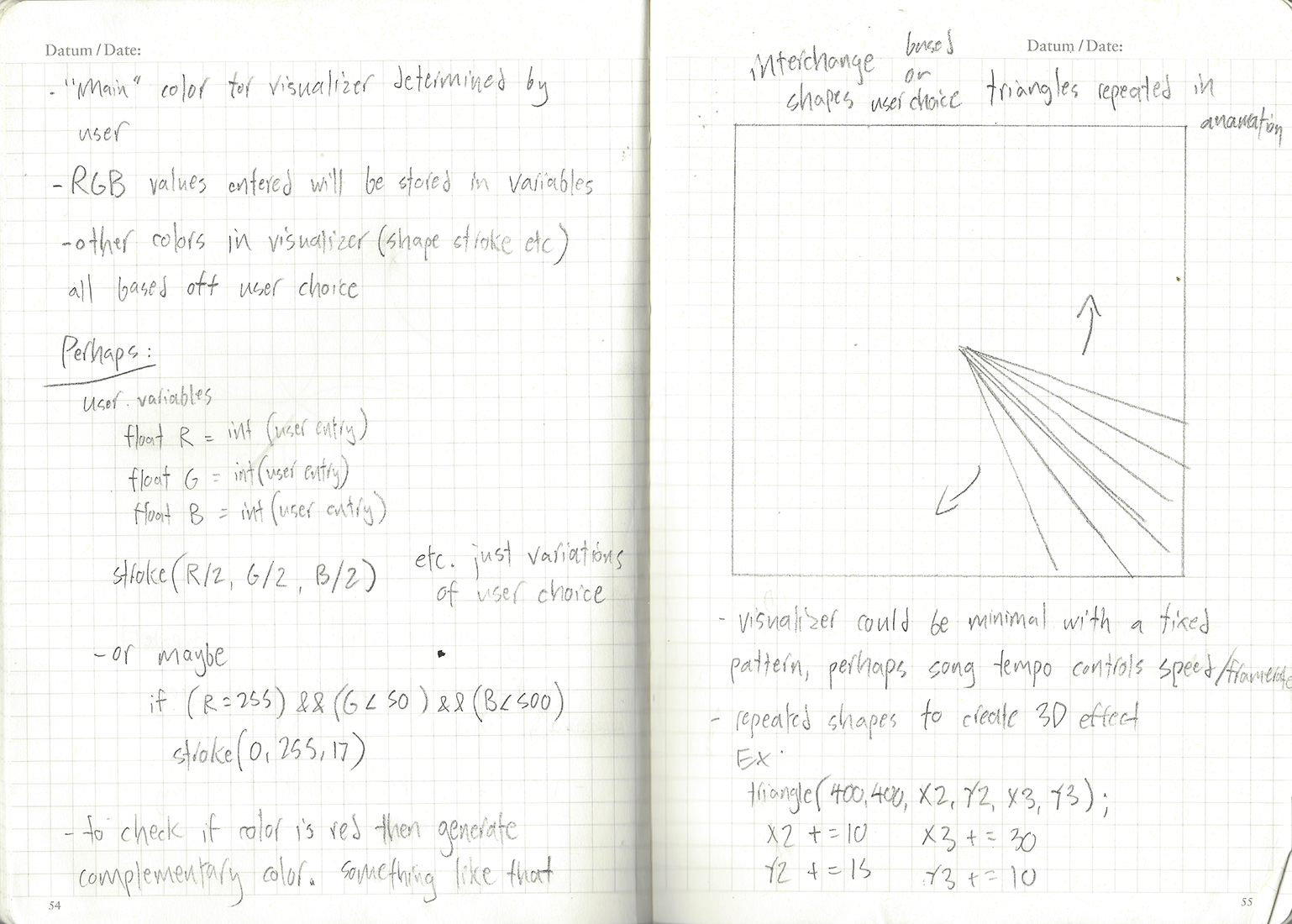
Before the coding process, I sketched several UI concepts alongside some notes on
their accompanying UX features. From the beginning, I felt strongly that the user
must have customization control over the visualizer, and the visualizer animation
should be directly linked to the bpm of the song, effectively shifting and moving
with it.
I decided that the visualizer would consist of overlapping transparent shapes with
varying stroke colors, attached to different waveforms from the chosen song file.
The user would have the option to customize these shapes, and choose either
rectangles or ellipses. The user would also be able to choose the stroke color, from
various static colors or constantly shifting random colors for a rainbow strobelight
effect.
Rough Versions / Development
The first version of the project was meant to develop the visualizer animation and
functionality, with a rough UI meant to brainstorm color schemes and develop a
feeling to work from.
I began by stacking several ellipses and tying their dimensions to the left and
right channels of the currently playing stereo audio track using the
minim
library. Each circle relied in a different manner on the audio channels, creating a
fluctuating, versatile, geometric effect. I also added a version of this using
rectangles instead of ellipses. For the UI, I decided on a black background, to
match early iTunes visualizers.
In the next version of my project, I added customization options. I added
functionality to switch between “ellipse” and “rectangle” options, and afforded the
user basic color (blue, red, yellow) + a rainbow option that would change to a
random color on each beat of the song. I also experimented with “fill” and “no-fill”
options for the shapes used in the visualizer. The type included in the rough
version was meant for my own personal reference during testing and would later be
implemented into the final UI.
Final Product + User Flow
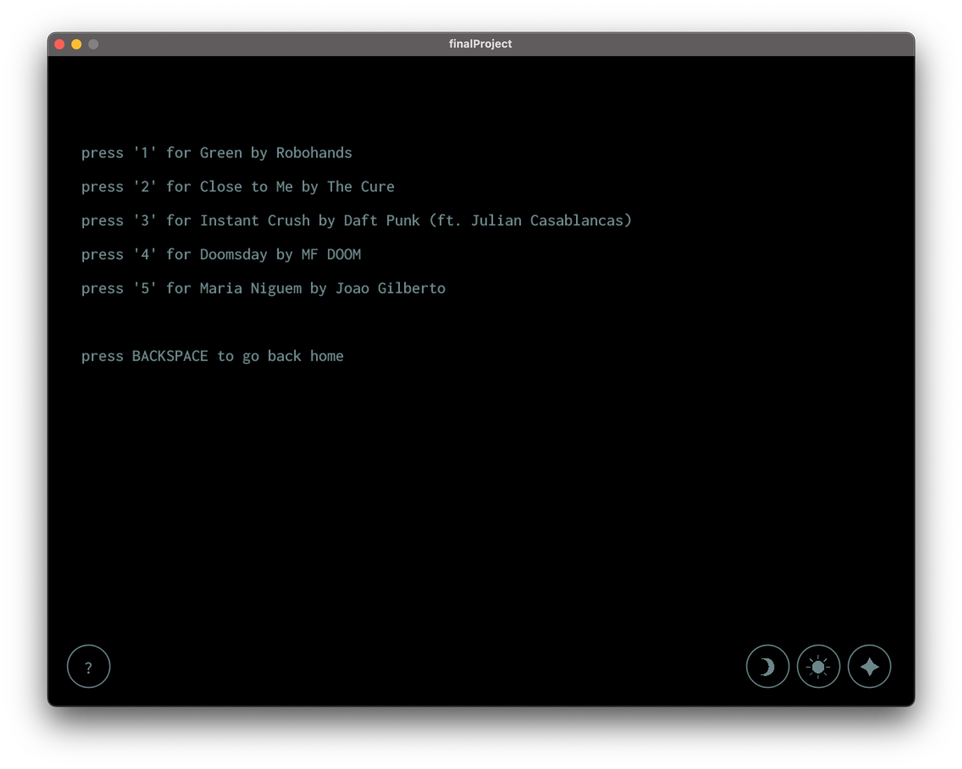
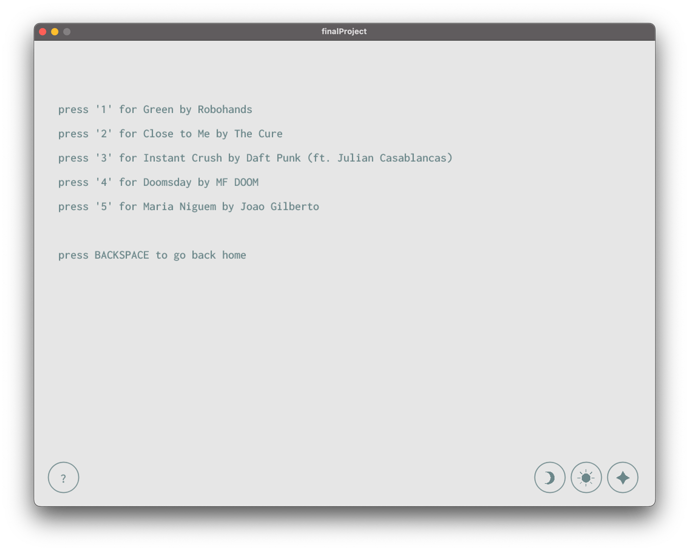
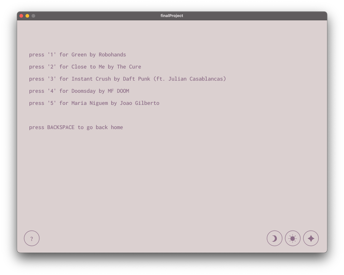
The final product contains a user flow starting at a “homepage” with navigation
controls leading to individual “now playing” pages for each song. The “now playing”
pages contain customization options for the visualizer, as well as play/pause
controls and control to return to the homepage. Also included on the homepage are
several color-scheme options for the UI, with a default “dark mode,” “light mode,”
and “alternate.”
At the top of each “now playing” page exists a bar showing progress through the
song, as well as a background animation simulating stars and space, as well as an
expanding array of dots following the cursor. The “now playing” pages were designed
around a centered visualizer and emphasis on the song name.
Click
here
for a video demo, and
here
to try the app yourself.
